CSS Continued
Sept 6, 2022
CSS Boxes
We mentioned before that each HTML element is surrounded by a box. There are many CSS properties that allow us to make changes to this box, like changing the size, adding borders, manipulating padding and margins, and showing/hiding boxes.
width, height
The default size of a box is the size of its contents. The width and height properties allow us to set our own dimensions. Sizes are specified in pixels, percentages or ems. For percentages, the percentage specified is the percentage of the containing element.
p { width: 50%;
    height: 500px; }
min-width, max-width, min-height, max-height
The min-* properties specify the minimum size an element’s box can be. The max-* properties specify the maximum size the element’s box can be.
 p { max-width: 450px;
min-height: 100px; }overflow
When we are setting our own dimensions, there is a chance that our content will take up more space than we’ve allowed. The overflow property tells the browser what to do in this case. * hidden - hides extra content that doesn’t fit * scroll - adds a scrollbar, so content can be scrolled
p { max-height: 20px;
overflow: scroll; }Every box has three additional properties that can affect its appearance:
- border - every box has a border, even if it is not visible and set to 0px
- margin - the area of the box outside of the border
- padding - the area of the box between the border and its content
border-width
The border-width property specifies the width of the border. The value is specified in pixels or “thin”, “medium”, or “thick”
p { border-width: 1px; }border-style
The border-style property specifies the style of the border line * solid - solid line * dotted - square dots * dashed - series of short lines * groove - carved style * none - no border
p { border-style: dotted; }border-color
The border-color style specifies the color of the border using the color styles we learned earlier.
p { border-color: #ee3e80; }border
There is a border shorthand that allows you to set some of the border properties in one go. They must be in the order of width, style, and color.
p { border: 2px dashed DarkCyan; }border-radius
A new property in CSS3, border-radius allows us to have rounded corners. The value indicates the size of the radius in pixels.
p { border-radius: 5px; }padding
The padding properties specifies the size of the area between the content of the box and the border of the box.
p { padding: 10px; }margin
The margin property specifies the area between boxes. Special note: if a box sits on top of another box, the margins are collapsed down to be just the larger margin.
p { margin: 10px; }display
The display property allows us to override an element’s default. It can also be used to hide an element.
- inline - causes an element to act like an inline
- block - causes an element to act like a block
- inline-block - element will flow like in-line, but retain their block-level properties
- none - hides an element
CSS Lists
list-style-type
The list-style-type property specifies the style of the bullet point.
- none - no bullet point
- disc - filled round
- circle - hollow round
- square - filled square
- decimal - 1, 2, 3
- decimal-leading-zero - 01, 02, 03
- lower-alpha - a, b, c
- upper-alpha - A, B, C
- lower-roman - i., ii., iii.
- upper-romain - I, II, III
CSS Tables
The default styling on tables doesn’t help much to follow the data, so if you are presenting tabular data, follow these rules to make sure that the data are easy to follow:
- Add padding - add padding to cells to improve their readability
- Distinguish headings - in addition to the default bold, consider setting headings to uppercase or adding a background
- Banded rows - If you shade/color alternating rows, it can help the reader follow your data, especially in long rows
- Align numerals - numeral data should be aligned on the right, like in a spreadsheet
- Hover style - For long rows, consider a :hover style
empty-cells
By default, empty cells sometimes cause problems with the display of borders or sizing of cells. The empty-cells property can help with these issues
- show - show the borders on empty cells
- hide - hide the borders on empty cells
table { empty-cells: show; }border-spacing
The border-spacing property controls the gap between cells.
table { border-spacing: 5px; }border-collapse
The border-collapse allows you to collapse the borders into a single border. border-spacing and empty-cells properties will be ignored.
table { border-collapse: collapse; }CSS Forms
As with tables, the default styling of forms is not as usable as it could be. We can use CSS properties to make the user’s experience of filling out the form less arduous. Consider these properties:
- font-size - to increase size of text
- color and background-color - to match styling of site
- border - give borders to input box
- border-radius - rounded corners on input box
- :focus and :hover - use to change the styling when the user is in/hovering over an input box
Additionally, input alignment is often a problem in the default styling. We can use the float property and text-align to make sure our input boxes will appear in the same alignment.
.label { float: left;
         width: 100px;
         text-align: right;
         padding-right: 10px; }
CSS Positioning
There are four types of positioning that we can accomplish in CSS, in addition to the ability to float elements.
- static - this is the normal flow of elements
- relative - positioned relative to its normal position.
- absolute - this moves the element to a specific position within its containing element
- fixed - is positioned relative to the viewport, which means it always stays in the same place even if the page is scrolled.
Fixed width vs liquid layouts
Fixed Width Layout
A fixed width layout is one that has a set pixel value, which means the layout designs do not change as the user increases or decreases the size of the browser window
Advantages
- Accurate pixel positioning
- Can control line length
- Control over position of items
Disadvantages
- Big gaps on page edge
- User font size may impact
- Works best only on laptop/desktop
Liquid Layout
A liquid layout will stretch and contract to fill the user’s browser window size. Dimensions are often set with percentages.
Advantages
- Less wasted space
- Small screens don’t cause horizontal scrollbars
- Tolerant to user font size
Disadvantages
- Less control over look
- Long lines of text
- Fixed width pics vs small boxes
Layout Grids
A grid structure is often a useful tool for setting the placement or arrangement of content. Grid sets are used to provide consistent proportions for various pieces of content.
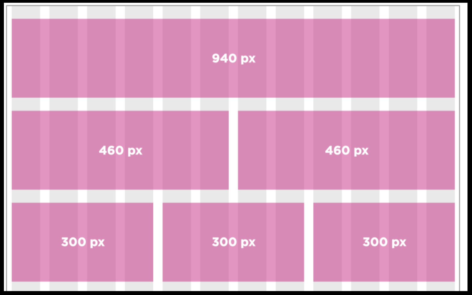
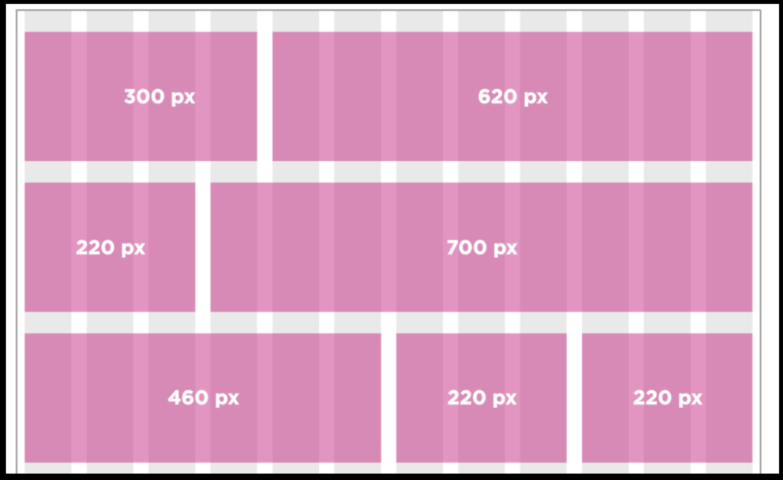
Frameworks
CSS frameworks are a quick way to get up and running with common grid sets, but they often add “bloat” to you app, since you usually don’t need everything they offer.
- One such framework is the 960.gs framework, which implements a 960px fixed width layout.
- Another is a the UnSemantic.com framework which implements a fluid layout instead